The internet is a great place – it first gave us online price guides for our precious Magic: the Gathering cards. Now building and sharing deck lists are becoming as ubiquitous and necessary to players as having WiFi in a home. MTG deck builders have been getting better over the years – certainly no more scribbling card names on notepads. So which offers the best deal to players? We look at 7 options on both desktop and mobile so that you know where to build that next net-deck!
AetherHub
Putting aside their deck builder for a moment, Aetherhub has a very impressive presence among the MTG community. Apart from articles, their YouTube channel is growing and is most well known for its summaries and retelling of MTG lore. In addition they’ve built apps to help players, which you’ll read more about them below.
The Deck Builder
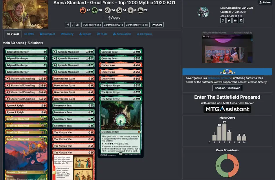
Aetherhub’s deck builder works very much like the one on MTG Arena, if not somewhat less stylish. You enter a card’s name, search, and then click on it multiple times to add to your deck list. However it doesn’t seem to offer a blank pad where you can copy and paste a card list to auto-generate the deck.

One of the plus points for Aetherhub is that you don’t have to create a profile to actually build the deck. You won’t be able to save it without a profile, but for a one-time share, it comes in handy. Another big feature is the ability to compare any deck on the Aetherhub website to your own decks using their app MTGAssistant. Like other companion apps, MTGAssistant (currently Windows only) taps onto game data from Arena and can provide useful stats and trends.
How Does the Deck List Look?
Their default visual view is a nice welcome, since many players quickly recognise cards by their art rather than by the names. Naturally there’s also a list view and plenty of export and sharing tools for most players. However the links’ dark shade hampers the user interface and can be easily overlooked. If they could make a small change the experience would be so much better.
Archidekt
With a postmodern name like Archidekt, anyone would expect great things. Well, we got both the good and the…not-so-good.
A slick, tech-inspired landing page gives you the option to sign up or just play in the builder sandbox. The sandbox lets you try out all the builder features, but unfortunately doesn’t let you save any decks.
The Deck Builder
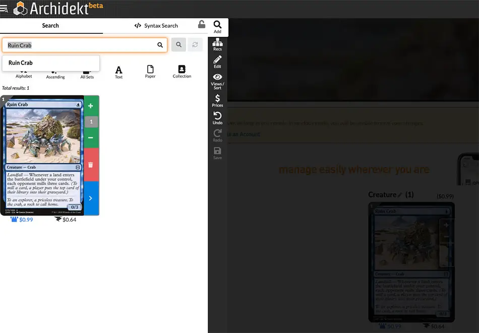
Of all the deck builders, Archidekt looks the most innovative and tries to find an alternative to traditional deck list layouts. But that doesn’t necessarily mean it is the most intuitive. The sliding animations increase the site’s responsive feel, but functionally it doesn’t add much value. The site also features a pullout side menu, where you can access different tools via sub-menus. For first time users, it can be quite confusing to search for the features or tools you need, and will need regular use to get familiar with.
How Does the Deck List Look?
In essence, the deck builder and deck lists are integrated because of the pull-out menu integration. Archidekt uses a default visual view for their deck lists, and has a nifty feature where cards slide in and out to show the full image when you hover over it (desktop only).
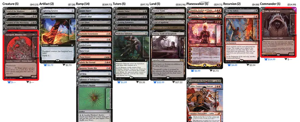
They have a play-test simulator, very similar in look and function to the one at Moxfield (see below). However, unlike Moxfield, there doesn’t seem to be an option to play multiple turns, or do special actions such as tapping a Land.
ManaBox
Disguised as deck builder app, ManaBox actually has the makings of a MTG super app, one that is able to keep track of your personal card collection while reading the latest news on Magic. It’s an impressive app that has grown over recent years thanks to continuous feedback and tweaks by the developers. The only downside here is that ManaBox is only available on mobile, so most of the time you’ll be viewing all of this on a small screen.
The Deck Builder
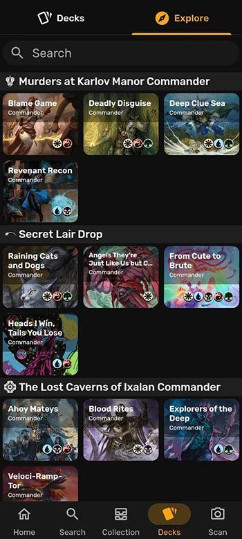
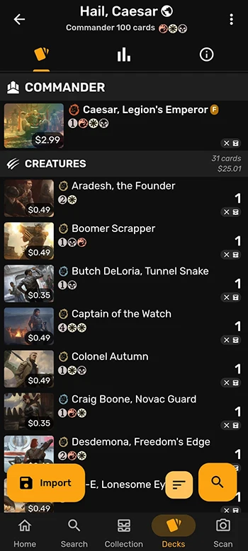
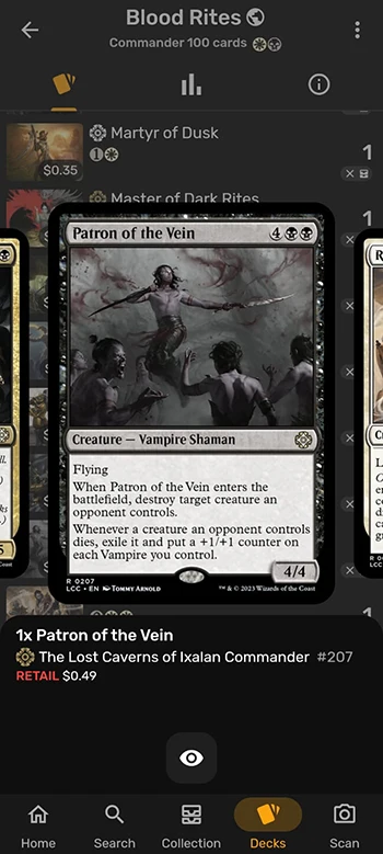
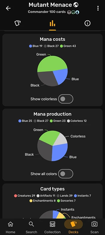
ManaBox’s deck builder is slick to handle, thanks to finger gestures being available on mobile. The deck list is neatly compact but every bit of detail is easily readable. The developers smartly used only a small thumbnail of a card’s artwork to represent it, and it’s big enough for seasoned MTG players to recognise the card they are looking at. Building a deck is pretty straightforward, and we were impressed with how fast a card that we searched for was loaded. This could be due to a built-in database that we were prompted to download on the home screen.
ManaBox also comes with a deck simulator where you can digitally play-test the deck you had just built. Playing a dummy game on mobile is similar to playing on MTG Arena – if you’re used to doing things on a nice, big desktop monitor, a small mobile screen might be too much of a leap. Unfortunately the simulator is also a Pro feature, so free users will be unable to utilise this rather important tool.
How Does the Deck List Look?
Despite the small mobile screen, it was hassle-free to create decks, add or remove cards. Without the screen real estate, you won’t be able to see your entire deck in one glance, unlike deck builders on a desktop monitor, but if our builder was only available on mobile, ManaBox actually has a very user-friendly interface. We’re pleasantly surprised with the amount of care that went into the user interface, and combined with the app’s other features (e.g. scanning cards to add to your collection), ManaBox is a good option for anyone who is constantly on the move.
Moxfield
A very new entrant into the deck builder scene, Moxfield has the benefit of learning from the mistakes of others. It’s looked at what’s lacking or inadequate in other builders and makes a noble effort to get it right on their own. There are some features that are mighty impressive, and a good deck builder website also goes beyond the tools and needs to excel in design as well.
The Deck Builder
The layout is clinically clean, and you might think a librarian had organised the user interface, icons, and overall experience of the website. Because of that, one can comment that the look and feel is on the dull side. Functionally, the deck builder has all the tools you will need. You can build decks and import lists the same way as other sites – nothing special there. The cool stuff actually comes later, in the unique tools and stats
How Does the Deck List Look?
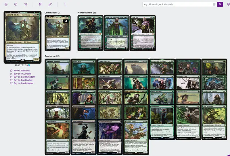
One of the great things about Moxfield is its wide range of customised viewing options. You can sort decks by card type, images, text, tags and more. Happened to see another deck that you would like to emulate? Moxfield lets you duplicate it into your own deck collection with just 1 click.
While most sites, including Moxfield, has an “opening hand” simulator where you are shown random 7 cards drawn from your Library to see if your Mana base needs tweaking, Moxfield goes one big step further.
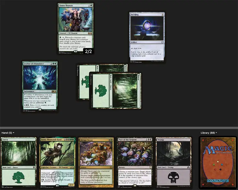
We couldn’t find a name for it, but it is essentially a gameplay simulator where you are shown a Battlefield overlay (not too dissimilar to MTGO or Cockatrice). You draw your opening hand, and you can drag and drop Lands, cast spells, and even go onto your next turn. There’s no opponent in this simulator, but it’s a nice step-up that allows you to visualise your plays for as many turns as you want.
Their other really nifty feature is their analysis of your Mana curve. By looking at the Mana Values of all your cards in your Library, it can tell you the percentage chance of casting spells on curve. See our example below:
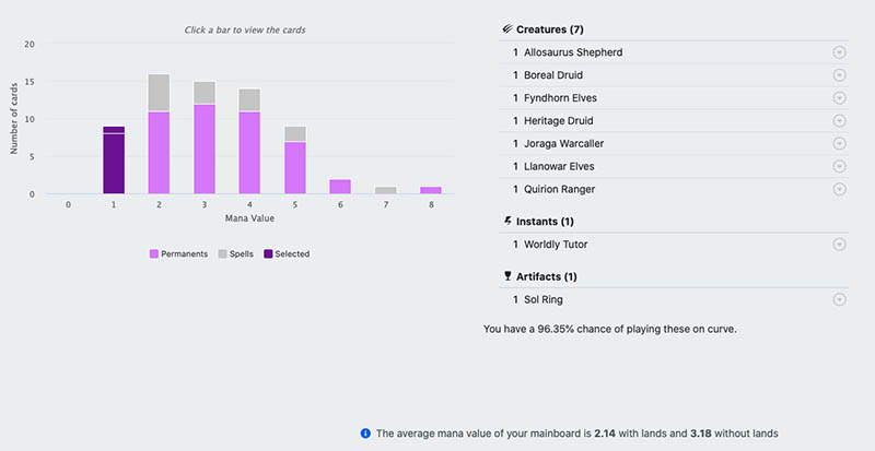
You can easily overlook the information because of the small text, but above it says I have a 96.35% chance of playing my 1 Mana Value cards on curve. On curve means casting a 1-cost spell on turn 1, 2-cost spell on turn 2, and so on. This is a great asset to have as you want your deck to be as optimised as possible.
Moxfield is in the forefront of providing the best user experience for Magic deck builders, and lately they’ve included a “Get Proxies” option that can be found under the “More” tab of each deck list.
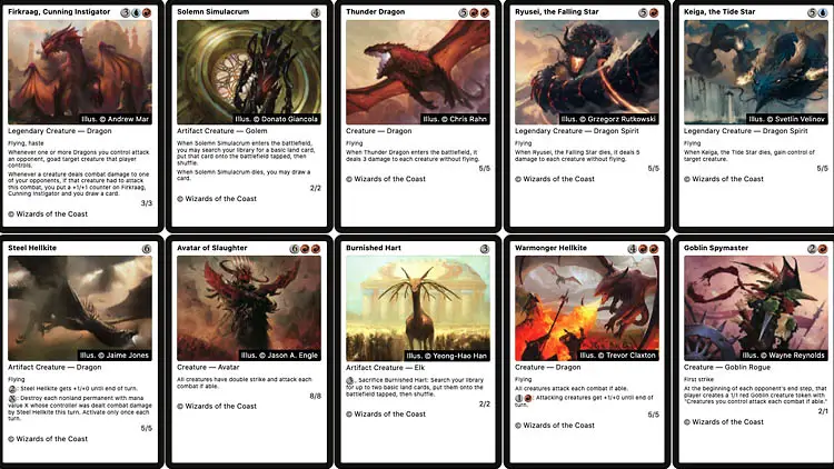
What happens is Moxfield will layout the entire deck’s cards into simple rows and columns. But rather than use actual card scans and risk the wrath of Wizards of the Coast, they’ve elected to use plain white backgrounds for the cards. Anyone who is playing in their own casual groups or on the kitchen table can thus print these off at home.
With card prices continually rising, having a proxy option is always great to continue making the game accessible to anyone, regardless of financial background.
MTG Decks
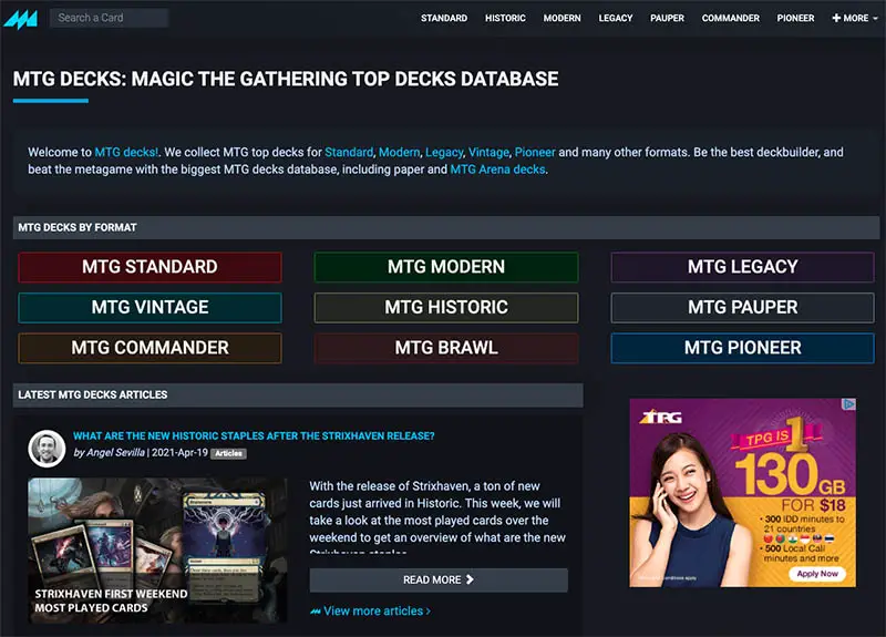
Harnessing the dark theme and splashes of colour to draw the user’s attention, MTG Decks reminds us a lot of our own website’s design philosophy. The menus and blocks are clearly organised, though at first glance it appears text heavy and light on images, at least more so than most Magic-related websites or deck builders.
The Deck Builder
From the landing page, it’s not clear where you can go to submit a deck. There’s a login link in the top left corner so we head for that. Unfortunately once there, it says the deck builder is currently in beta and open to invited individuals. Anyone is welcome to join the waiting list.
May 2021 Update: Registration to the public now looks to be open, and you have to sign up to build any deck list. There’s a minor catch though, as they have to be “Event Decks” that you have actually used in a sanctioned tournament. To make things worse, the submit button is located way below the fold of the front page. It almost feels like they’re discouraging even serious players from submitting their decks.
How Does the Deck List Look?
Right from the homepage, you can scroll down a list of submitted decks, but the lack of images and awkwardly dark hyperlink colour makes reading difficult. Like many other sites, they have both visual and written lists, and price references for individual cards you look up.
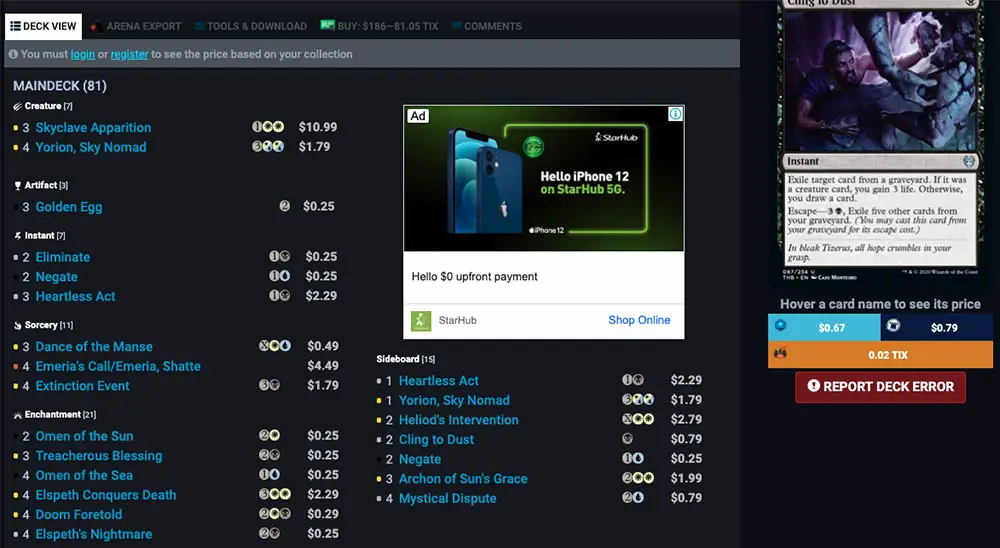
One nice feature is that “Similar Decks” tool, which will search on MTGDecks all other lists that are aligned closely to the deck you are currently viewing. Although the criteria isn’t made clear, from some testing it appears to match deck colours as well as archetype. So if you were looking at a Goblin deck in Historic, you’d likely see a list of Goblin variants if you search for “Similar Decks.”
MTGGoldfish
While I don’t know anyone at MTGGoldfish, it’s clear they put a lot of thought into design and user experience. The entire website, even their content articles and price guides, are easy on the eyes. It’s no surprise that they are one of the biggest MTG websites out there.
The Deck Builder
A clean layout, with its best feature being a preview option that will show how your deck list will appear. You also don’t have to create a user profile to make a deck list. If a player just wanted to quickly share a visual list without needing to save it, this would be the best and prettiest way to do it.
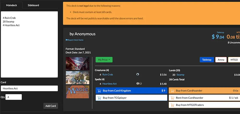
How Does the Deck List Look?
Cleanly formatted with all the important info nicely displayed, the MTGGoldfish deck list is one of the best. It displays the deck price in the major mediums of paper, Arena and MTG Online. You can also toggle between text and visual views, for those who easily get cross-eyed when there is too much text.
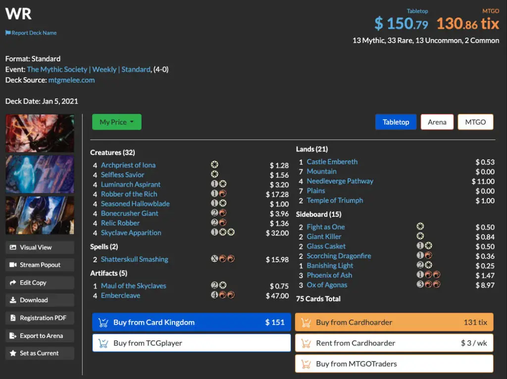
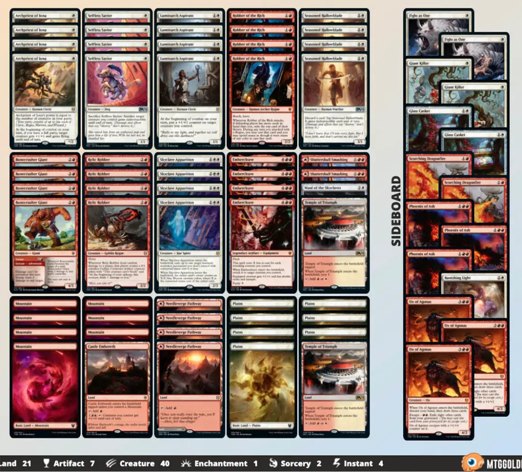
One other nifty tool is its ability to “export to Arena.” For those who have used Arena, you’ll know that cards in a deck list also come with a unique identifier. With this export function you can have an easy upload rather than searching for individual cards.
Tappedout
Sadly Tappedout’s layout looks rather dated. The top banner appears unnaturally small, as though it was forced into a corner and is deliberately hiding from the viewer.
The website’s colours do not gel well, and the multitude of colours means the eye cannot focus on one single spot as it is drawn to everything at the same time.
The Deck Builder
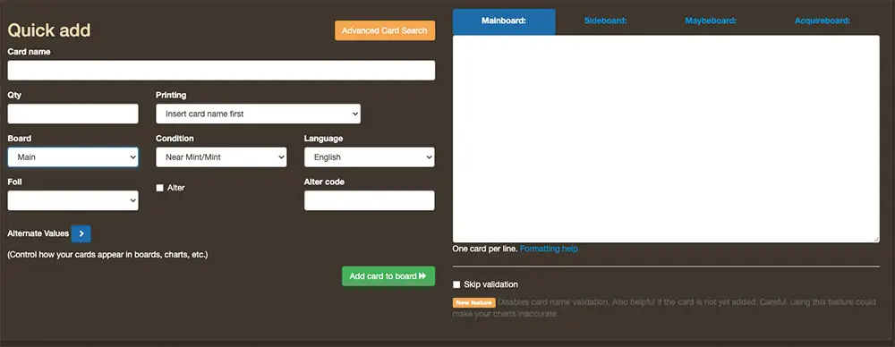
A straightforward process that allows you to quickly add cards to the Mainboard or Sideboard without having to click away to another page. There are also plenty of options for preferences such as whether to keep the list private or public, if the card listed is in Foil, and if it belongs to a Limited format such as Draft or Sealed.
How Does the Deck List Look?
The deck viewer is much better organised than the overall site, and each list provides ample information, just about anything one might ask when building the deck. There’s mana-curve analysis, breakdown on card types, and an estimated cost based on other online shops such as Card Kingdom and TCG Player.
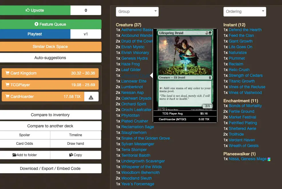
Individual card preview are on the small side, and you’ll find yourself squinting and staring close to the screen to read small text, especially for unfamiliar cards. But each preview also contains pricing info for that card, which will be very useful.
End Step: What’s Our Favourite MTG Deck Builder?
All the deck builder offerings are pretty robust in terms of feature set, so if you’re looking for a simple list to build and refer back to from time to time, then any of the sites here will work.
However in terms of design, layout, and user experience, most could use some refining. Some deck lists are hard to read because of unusually-dark colour of the text or links. Overall, of all the sites reviewed here, we would recommend MTGGoldfish and Moxfield as they are both feature rich and easy to navigate.
But if you’d like to synchronise your decks with those you build on MTG Arena, then Aetherhub would be the best option as it offers compatibility with MTGAssistant.
Are there other deck builders that we missed out and are worth taking a look into? Please share in the comments, or e-mail us – will be happy to add on more entries to this list to give a better comparison!




It’s great to come across a blog every once in a while that isn’t the same out of date rehashed material. Fantastic read.